FinOps Workbench
Zuora
A 0-to-1 finance operations workbench. Five tools became one. I designed the trust foundation first, then the AI agent layer on top.
Freeing finance teams from manual oversight
CONTEXT
Ramp's autonomous agents handle fraud prevention, policy enforcement, and cash flow optimization. That's the design surface I'm working on at Zuora right now: what an agent can see, what it can propose, where humans stay in the loop, how access scope shows up in the interface.
DECISION
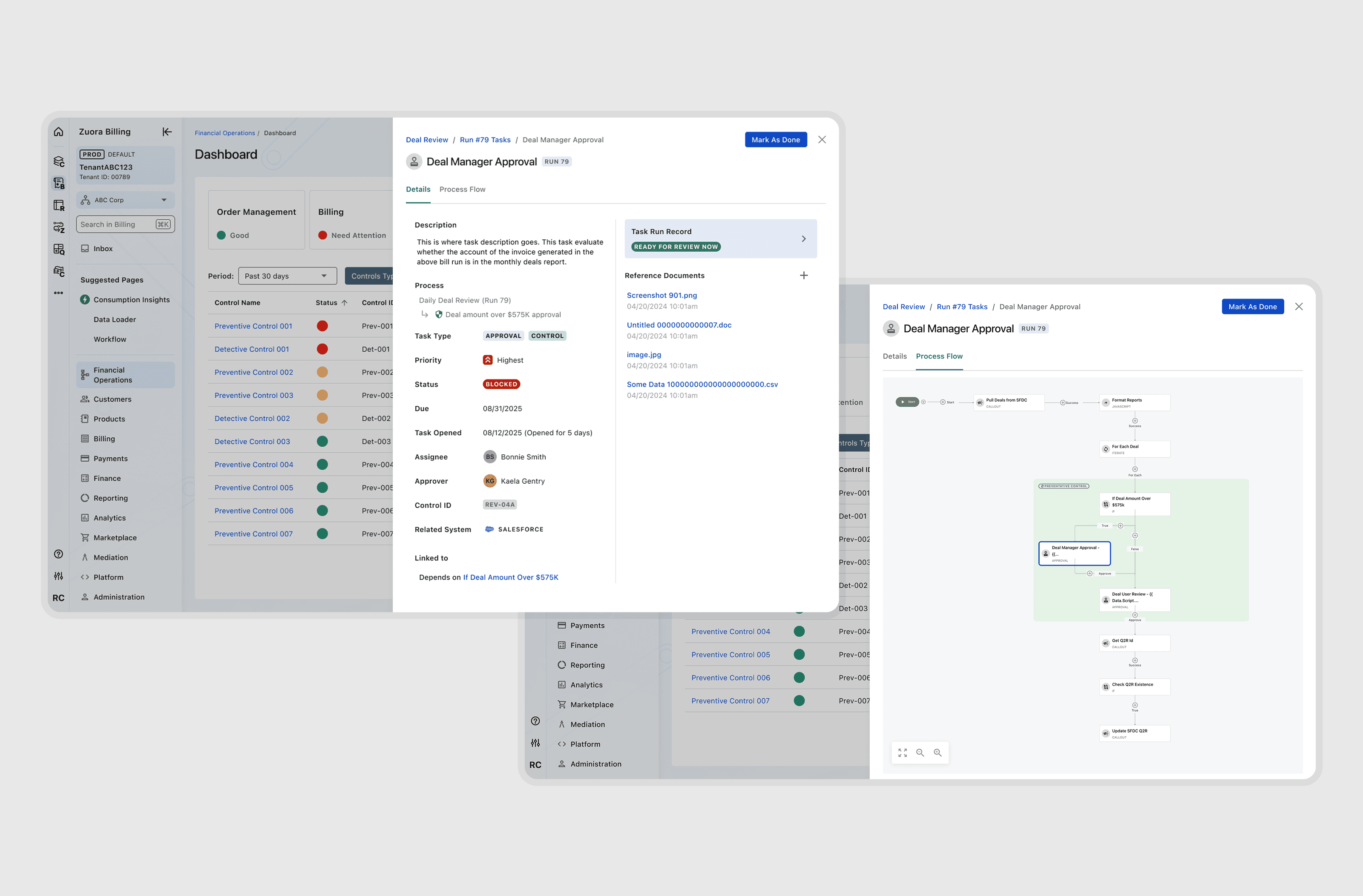
Phase 1 MVP shipped without Timeline, automated workflows landing well with operators and their managers. Weekly research with our design partner group (long-time customers helping us shape it) reframed phase 2: people personally accountable for financial decisions won't adopt AI they can't inspect. We built Timeline (the transparency and audit layer) before extending to auditors and shipping the agent capability.
OUTCOME
70% of design partners more willing to consolidate operations into the workbench.
85% of that group open to agentic AI because the reasoning was inspectable.
Transparency wasn't a feature, it was the prerequisite.
Research as a velocity tool

CONTEXT
The Workbench was a second attempt. A previous team's wizard-style version hadn't landed; ops work doesn't run in linear flows.
DECISION
I rewrote the brief: from "make each task easier" to "become the single place where the workflow and the evidence live." Before any pixel work, I validated the new positioning through a marketing campaign with prospective customers. Prospects responded; the resourcing followed.

Patterns that scaled past the product

OUTCOME
2 hours → 8 minutes
on a core reconciliation workflow
8 features, 32 design system components, full state coverage shipped to production. My Tasks, Notifications, the drawer pattern, multi-tab drawers, and stats-as-filter cards were adopted across adjacent product teams. Phase 2 (IT and auditors) and Phase 3 (executive leadership) build on the same foundation.

How I worked: Claude Code as the prototype loop
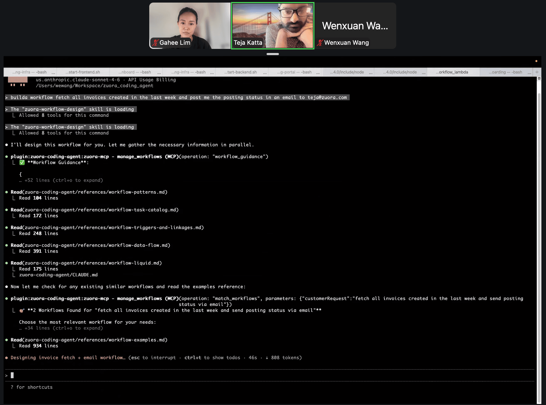


Agent behaviors need to be felt, not described. We prototyped directly in Claude Code so we could critique a working artifact, not a slide. A working session with Teja (PM) and Wenxuan (eng):
Test prompt for the agent workflow we'd just scoped on the Zoom call.
Generated workflow output, behavior we could read and critique together.
Workflow detail matched the spec on the first pass.
Generated data table held up too.
Sketch to engineering-ready in one session. I take the prototype into front-end code to match the design system.
Forms Builder Suite
Zephr
A three-layer no-code system that gave non-technical marketing teams independent control of consumer-facing subscription flows. Built in the lead-up to acquisition.
Designing the 80/20
(forms builder, CSS configuration)


CONTEXT
Marketing teams at WSJ, NY Post, Forbes, and GoPro had stopped using the previous builder.
16 → less than 1 monthly interactions per onboarded client Not because the tool was broken, but because every edit felt risky on a live subscription flow. They filed engineering tickets and waited weeks rather than touch it.
DECISION
I reframed it from a UX problem to a dependency problem and shipped a three-layer system:
Style Guide: brand and structural decisions made once, at the foundation
Interface Library: reusable components built on that foundation
Forms Builder: the assembly layer, where the structurally risky decisions are already locked in
Two important 80/20 moves:
▸ Block taxonomy as risk taxonomy. Three block types calibrated to consequence (cosmetic → commercial). Users always know how much control they have before opening a block, because the affordances tell them.
▸ CSS configuration as escape hatch, in the same edit panel as the simple cases. Depth discoverable next to simple, without making simple more complicated.
OUTCOME
+20% engagement
NPS +8
Weeks → hours
5 enterprise renewals (>$100K ARR each) closed at the wire
High agency under acquisition pressure
CONTEXT
Zephr was a startup in a compressed growth phase, and Forms Builder shipped in the lead-up to acquisition. Engagement was collapsing on the most commercial-team-facing surface Zephr had. Five enterprise contracts were quietly slipping.
DECISION
The team's first instinct was a fully customizable visual editor (Canva-like). I argued against it: that would solve for freedom, when our users needed confidence. I proposed a deliberately constrained system instead, stackable building blocks, intentional about what they allowed and what they didn't. Faster to ship. Safer for users. Right answer for the moment.
OUTCOME
$44M acquisition Forms Builder Suite cited as a contributing factor. The three-layer architecture became the framework for two further builders shipped post-acquisition.

